
Design & craft
Write a social media image brief a designer can work from
Make it feel premium is a reaction, not much of a brief. A designer still has to work out what the post should say, who will see it and which details matter. Before sharing a moodboard, explain the job the image needs to do. A few precise decisions can prevent a long exchange of attractive options that never quite answer the business problem.

Describe the decision behind the picture
Begin with the reader and the message. A ceramics studio introducing a breakfast set might want people to understand its scale, finish and everyday use. That suggests a different photograph from a collector’s piece presented as sculpture. Both can look considered, but they answer different questions. Name the one this post is meant to answer.
Write one sentence describing the intended response. For example: someone furnishing a small kitchen should be able to judge whether this set suits their table. Avoid asking one image to explain the entire range, introduce the founder and announce a discount. If there are several equally important messages, choose a sequence or separate posts and brief each one properly.
Provide facts and assets before references
Include the correct product name, material, colour and any detail that must be shown accurately. Supply approved logos, existing brand colours and current product photographs where useful. Mark which assets are mandatory and which are simply background. The creative team should not have to infer the final product from an old prototype or a retailer’s compressed screenshot.
For the breakfast set, provide measurements, show which pieces are included and explain any natural variation in the glaze. If the photograph includes food, utensils or another product, decide whether those props could confuse the offer. A persuasive image should help a person understand what they are getting. It should not rely on the caption to undo an avoidable misunderstanding.
Turn a moodboard into useful instructions
Choose a few references and explain what each contributes. You might like the side light in one photograph, the generous space in another and the informal arrangement in a third. Say so. A board of twenty unrelated images leaves the designer to guess which quality the client actually wants, and makes the first review unnecessarily subjective.
Also say what to avoid. Perhaps the studio wants lived-in surfaces but no staged mess, warm daylight without orange skin tones, or a quiet composition without decorative text. Keep these choices connected to the brand and audience. References establish a direction; they are not permission to copy another creator’s composition or imply their involvement with your product.
Plan a small set of purposeful shots
A practical shot list for the ceramics could include the complete set, a close view of the glaze and a hand holding the cup to show scale. Give each shot a reason. Identify the essential one before adding optional details, and agree what can be dropped if time runs short. This helps the photographer protect the most useful work.
List the intended placements and ask for room to crop. Keep important details away from areas likely to be covered by interface controls or text. Confirm the current dimensions for the actual platform and placement when exporting; do not assume one shape will fit everything. Review a mobile-sized crop before the shoot or design session is considered complete.
Agree permissions and text alternatives
Confirm where the finished work may be used, for how long and whether paid advertising is included in the agreement. Check permission for identifiable people, client material, locations and third-party artwork where relevant. If using stock, read that asset’s licence. Pexels, for example, permits free use and modification but prohibits implying endorsement by the people or brands shown.
Plan how essential visual information will be explained in text. W3C’s image guidance bases the alternative on the image’s role and meaning in context. For the cup photograph, useful wording might describe its shape and visible glaze rather than repeat a promotional slogan. Keep important prices, dates and instructions available in the accompanying text too, and check the platform’s supported accessibility fields.
Make the first review specific
Share who gives the final decision and what they will judge. Start with accuracy, the central message and readability at the intended size. Then discuss styling. Feedback such as the handle disappears against the background gives a designer something to solve. Make it pop could mean brightness, contrast, scale or simply a different personal preference.
Ask for final files in the agreed formats, with a clear distinction between editable originals and approved exports. Keep the selected version with the caption it belongs to. Save the brief and a short note about the decisions made, so the next commission starts with useful context. A good brief does not remove creative judgement. It gives that judgement a clear problem to work on.
Further reading
Official references behind this guide. Tool availability and platform requirements can change.
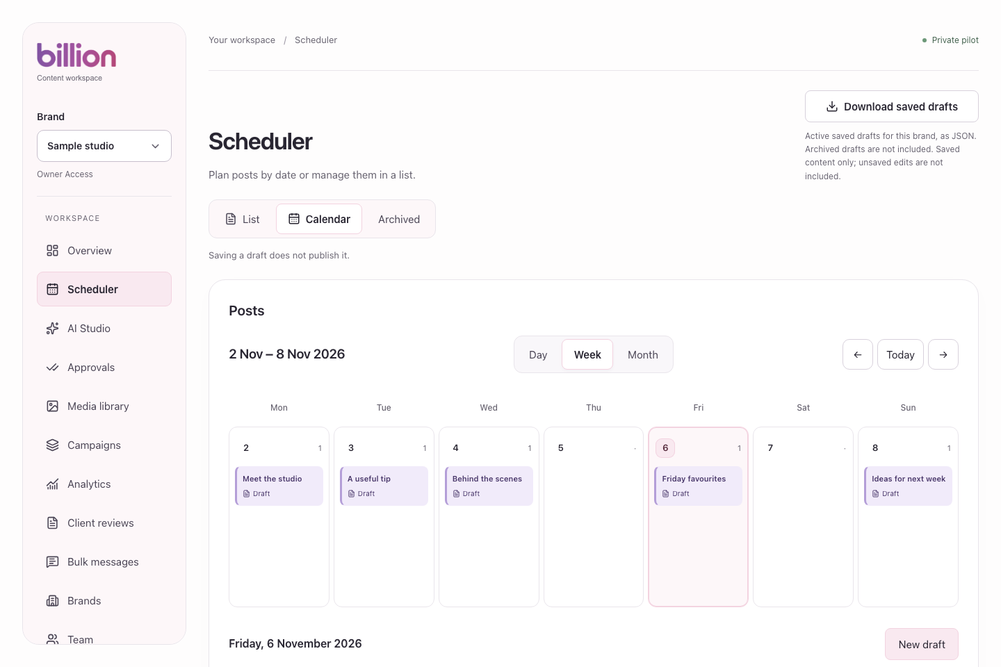
Designing Billion: From an Idea to a Social Media Product
A look behind the brand, product design, and development of Billion, and how By Bleona shaped one consistent social media management experience.
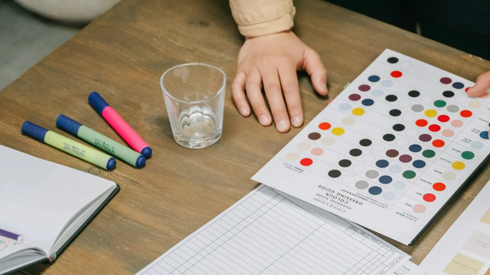
Build a Canva template system your team will actually use
Create a small Canva social template system with useful layouts, clear boundaries and reliable handoffs, so consistent content still feels considered.
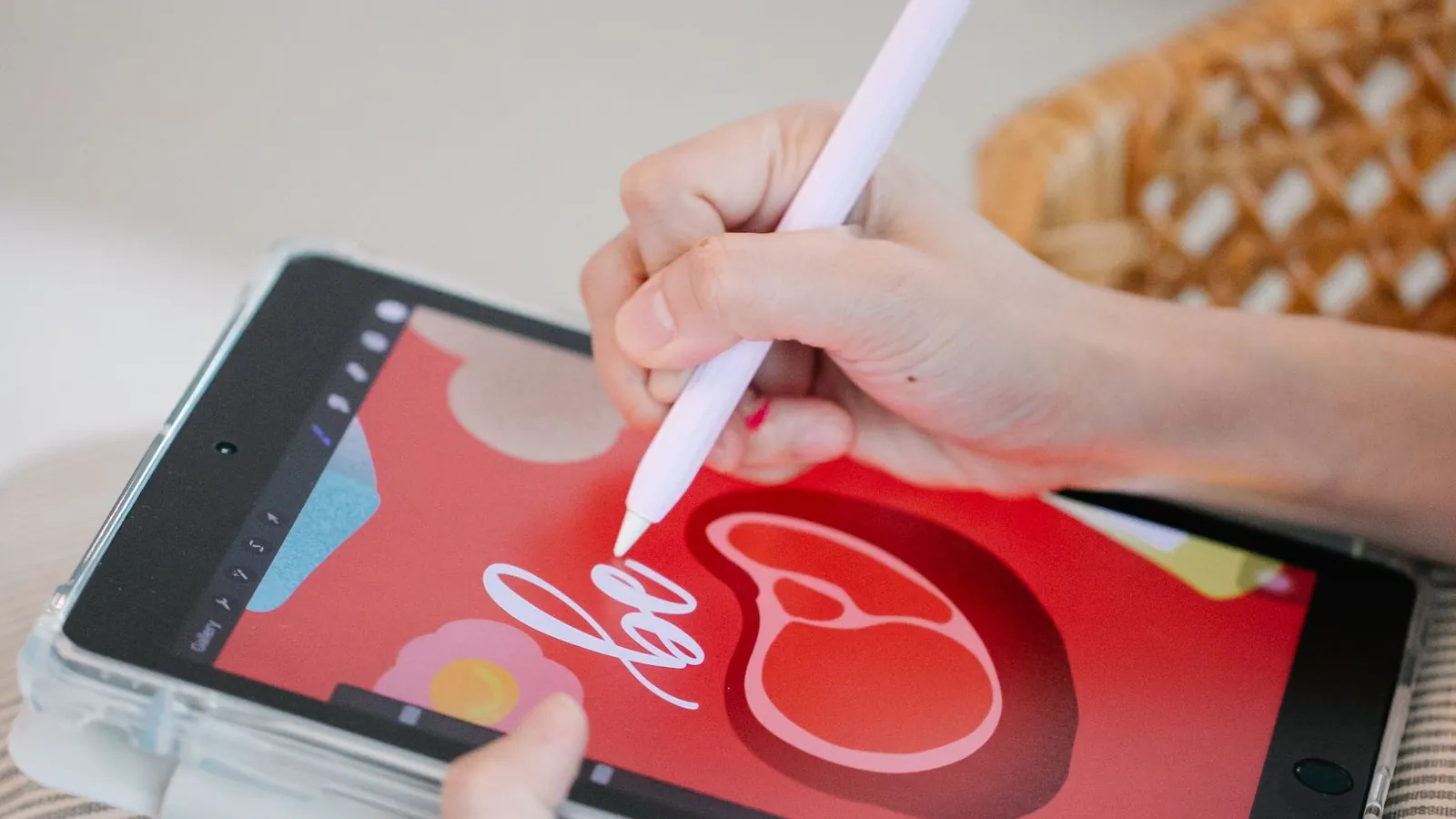
A calmer Figma workflow for recurring social content
Organize social designs in Figma with a small component library, resilient text layouts and clear review files that make campaign handoffs easier.